
Brand identity · Website · Learning platform
A distinctive identity and digital home for animal education, shaped by compassion, clarity and inclusive design.
Brand and website project · May 2026
Explore the Atticus website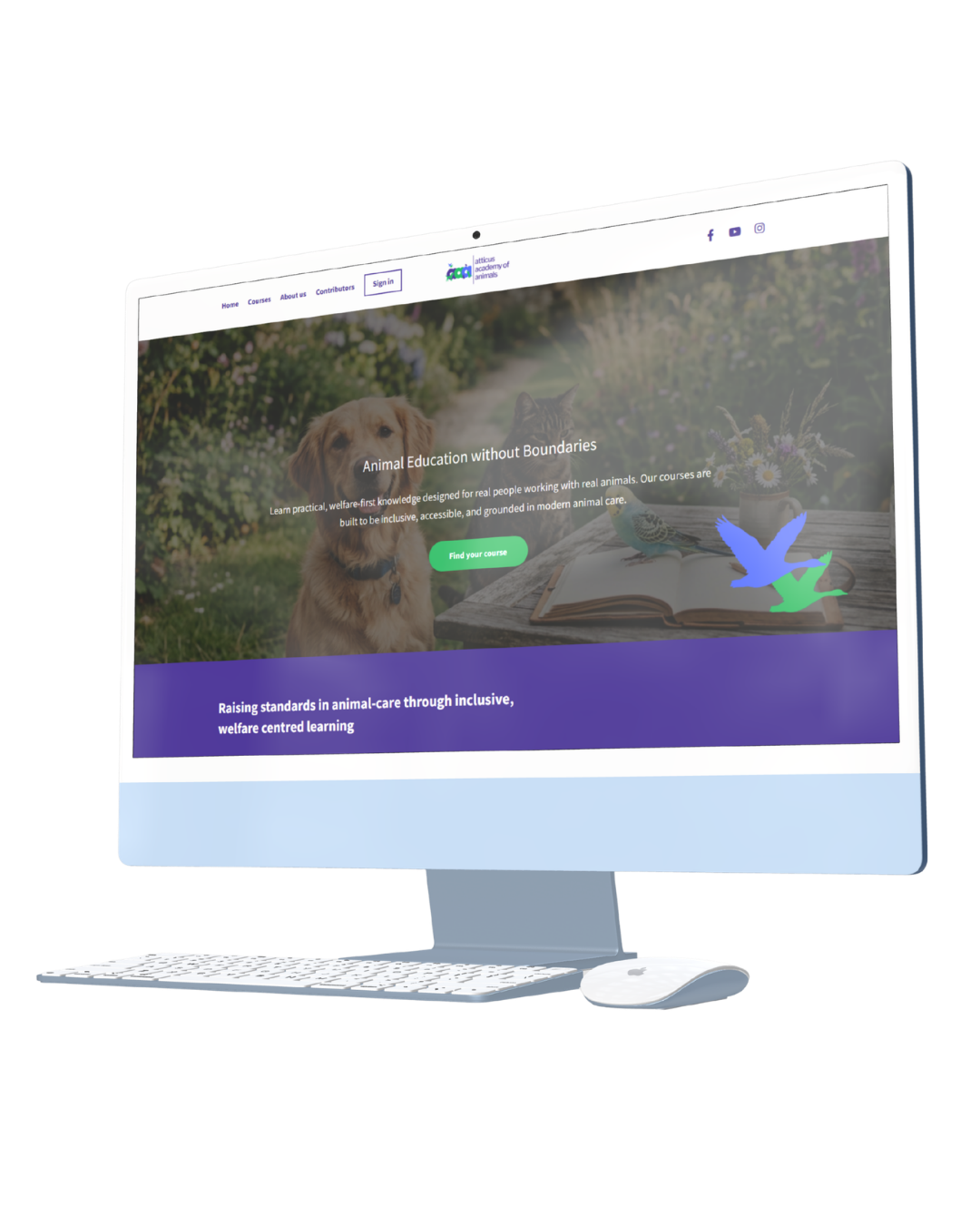
About the project
Better knowledge.
Better animal care.
Atticus Academy of Animals is an online education platform created to raise standards of knowledge and care across the animal industry.
In May 2026, I developed its brand identity and digital presence, creating a visual and verbal system that could communicate warmth, professionalism and an evidence-led approach to learning.
I also designed and built the Academy’s website on LearnWorlds, the learning platform selected by the client, bringing the identity into the online learning experience.
A recognisable visual language
Personality with
a purpose.
The identity needed to feel welcoming and distinctive while retaining the credibility of a professional education platform. I developed the logo system, colour palette and typography alongside supporting graphics and guidance for their use.
Custom animal silhouettes became a recurring part of the visual identity. They added an illustrative quality and created a recognisable thread across the Academy’s branding and digital content.
The animals reflected those featured in the educational material. The Podenco held particular meaning: one of the co-founders rescues Podencos and has learnt a great deal through those experiences.


Accessibility as a foundation
Designed with different
learners in mind.
Accessibility became a fundamental part of the project. With a diverse audience, including neurodivergent learners, the Academy needed a design approach that considered how people read, navigate and process information.
I researched the Web Content Accessibility Guidelines (WCAG) and used that learning to inform practical decisions across the brand identity and website.
Contrast and readability
Colour combinations were considered for their contrast and legibility, alongside typography, text size and hierarchy. Important information was not left to colour or visual styling alone.
Structure and predictability
Clear navigation, consistent layouts and manageable sections of content helped create a more predictable experience, with less unnecessary visual clutter.
Clarity without losing character
The aim was to retain the personality of Atticus while making content easier to follow, with clear calls to action and a considered balance of imagery and information.
Website and learning platform
A digital home
for learning.
The client selected LearnWorlds as the platform for the Academy. I designed and built the website within that environment, translating the identity into the pages and digital applications learners would encounter.
This meant considering the wider experience as well as the visual design: how content was grouped, how people found their way through it, and how the brand could remain consistent across the website and learning platform.
Predictable layouts, clear hierarchy and focused calls to action helped guide the design, with accessibility informing decisions from the beginning.
Visit Atticus Academy
Tone of voice and brand guidance
Warm in tone.
Grounded in evidence.
Atticus needed to communicate with compassion and warmth while remaining professional and evidence-led. Establishing that balance was important across both the website and the Academy’s marketing.
I developed tone-of-voice guidance and a practical brand cheat sheet so the whole team could understand how to apply the identity and communicate consistently.
Alongside the wider brand guidelines, certification emblem and partner guidance, this gave the Academy a shared reference for using the brand across different contexts.
A consistent voice, whoever is speaking on behalf of Atticus.
 View the full-size cheat sheet — opens in a new tab ↗
Developing my practice
Learning that changed
how I design.
I began this project without specialist knowledge of WCAG. Rather than relying on assumptions about accessibility, I took the initiative to research the guidelines and understand how they could inform my design decisions.
That process strengthened my understanding of inclusive digital design, particularly the relationship between brand expression, readability and the wider experience of using a website.
It reinforced an approach I now carry into my work: accessibility belongs in the foundations of a brand and website, considered from the beginning.
Testimonial from Atticus
“We cannot thank Steph enough for making our vision a reality. Having someone who was so passionate about our project and who understood how important it was to make this accessible to all has been such a joy.”
Get in touch
Interested in working together? Fill out some info and I will be in touch shortly. Alternatively, you can book a call with me via Google Meet below. I can’t wait to hear from you!