
Brand identity · Digital · Print
Building a clear, confident identity for specialists in industrial explosion protection.
An ongoing collaboration since 2021.
Brand identity · Digital · Print

Building a clear, confident identity for specialists in industrial explosion protection.
An ongoing collaboration since 2021.
About the client
Coopatex Limited specialises in industrial explosion protection. Its identity needed to communicate the professionalism and technical expertise behind a highly specialised business.
Our collaboration began in 2021, when I created the logo, branding and website. Since then, my work has extended across print, vehicle graphics, office spaces, signage and ongoing marketing support.
Building the identity
The brief was to create a brand that felt professional, smart and immediately recognisable within the industry. The logo needed a connection to the work Coopatex actually does.
I took inspiration from the detail of a slam shut valve, a piece of safety equipment, and used it to develop the logo badge. This gave the identity a visual link to the company’s specialist field.
Red introduced a sense of urgency appropriate to a business focused on safety. Paired with a clear visual system, it helped establish a confident and distinctive presence.
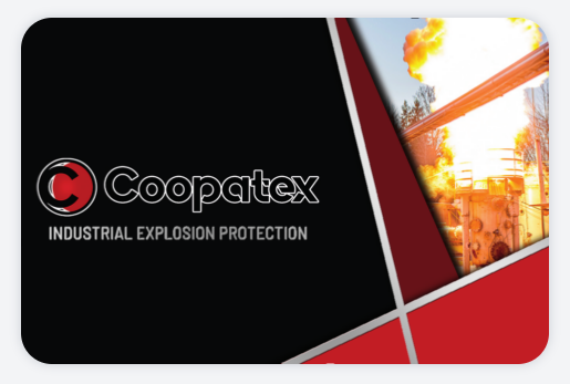
Brand guidelines, business cards and marketing materials carried that identity consistently across the business.
Vehicle graphics
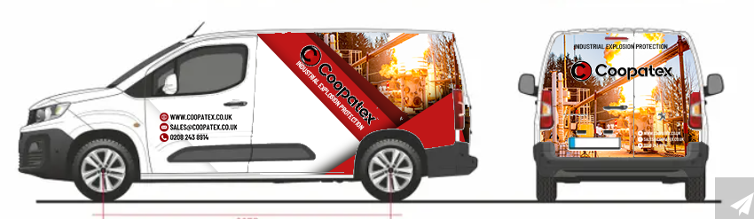
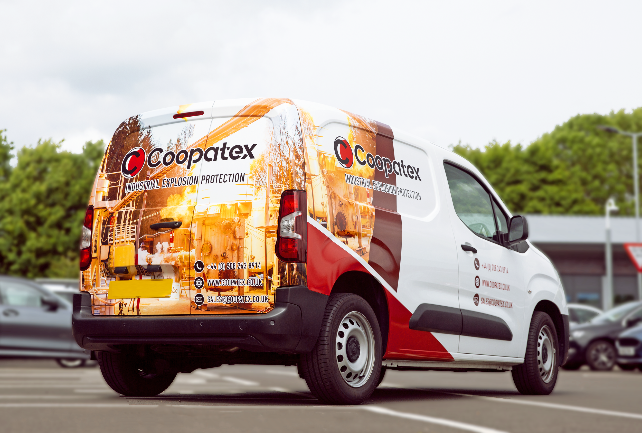
The van graphics needed to do more than carry a logo. They had to catch the eye and communicate what Coopatex does in an industry that many people may not immediately recognise.
I developed the design to balance a strong brand presence with clear information, using a 3D visualisation to show how the graphics would work across the vehicle before application.
Website creation
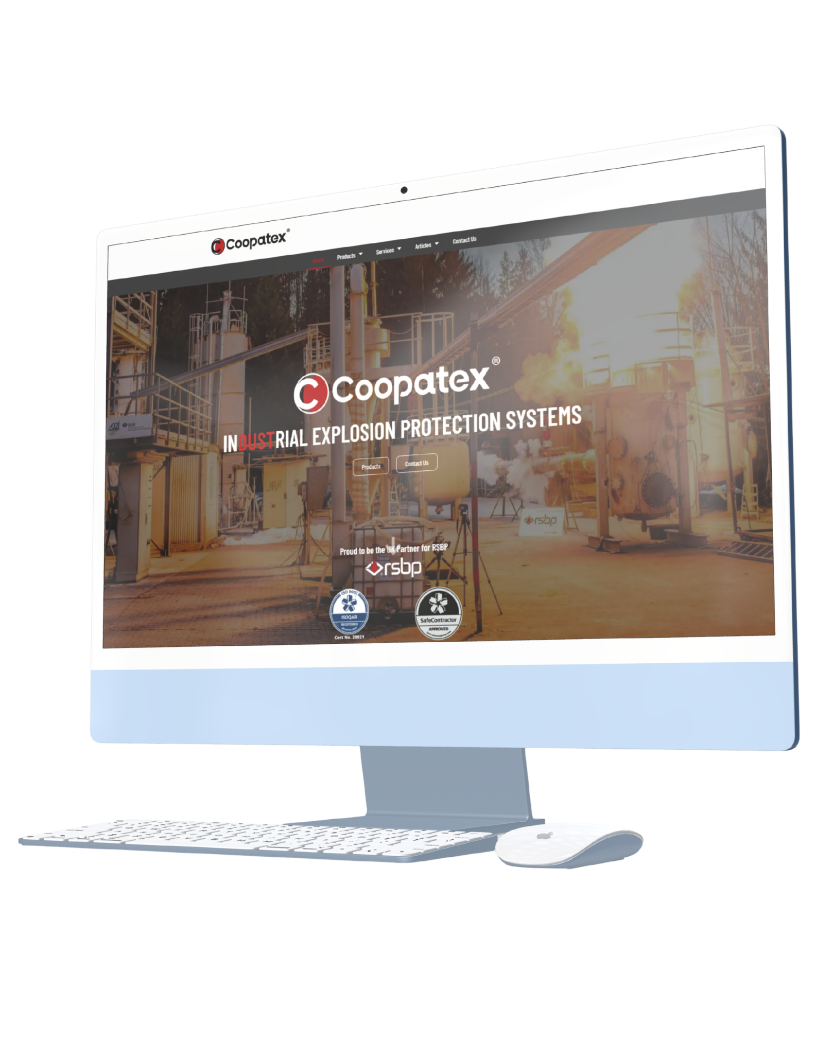
Creating the Coopatex website was a substantial part of the project. With so many technical components to include, the challenge was to organise detailed information into a clear, coherent experience.
The layout needed to be easy to navigate, helping visitors find the information they needed while maintaining the professional look and consistency of the wider brand.
Bringing a complex offering together in a website that feels structured, accessible and recognisably Coopatex.
Warehouse signage · 2026
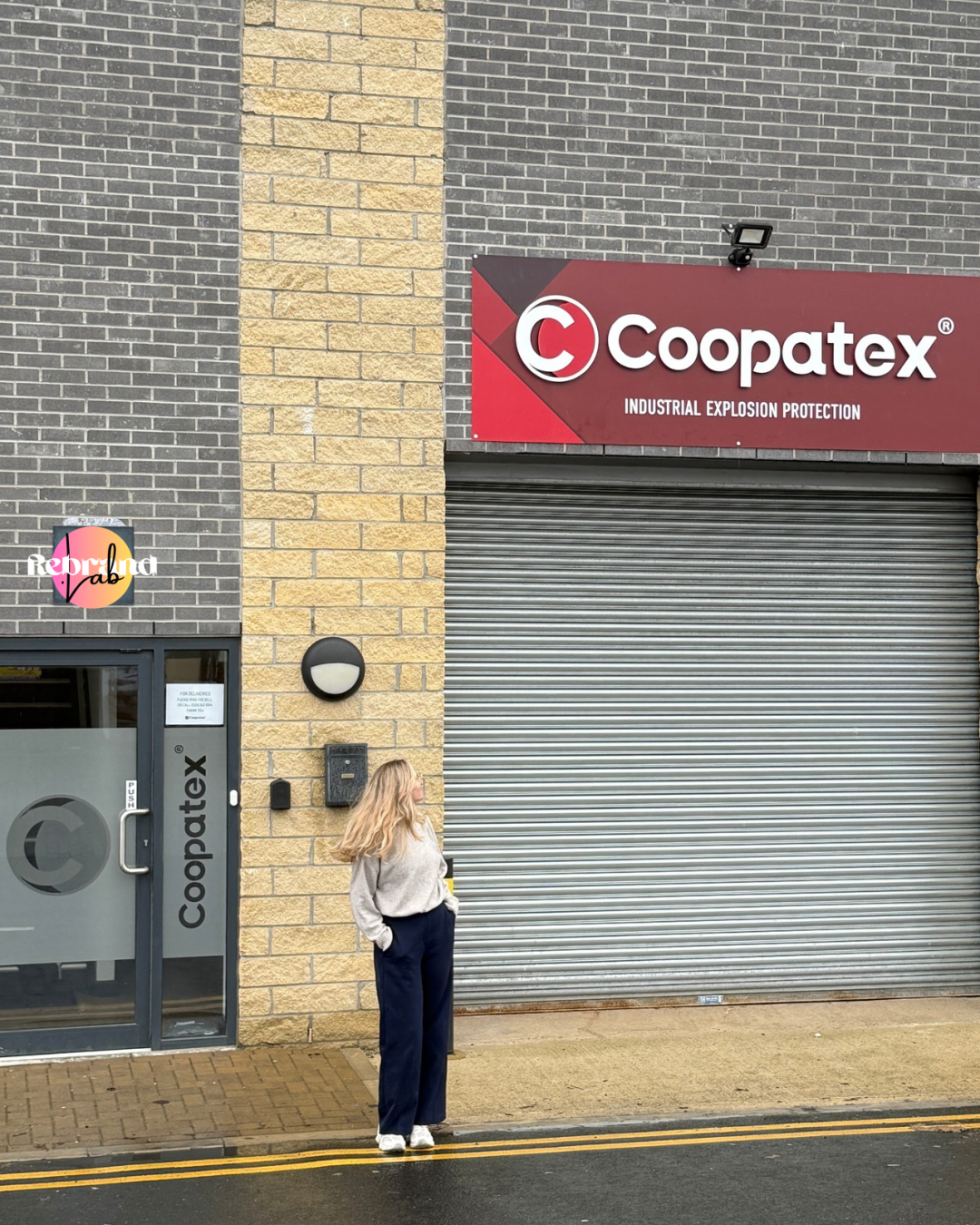
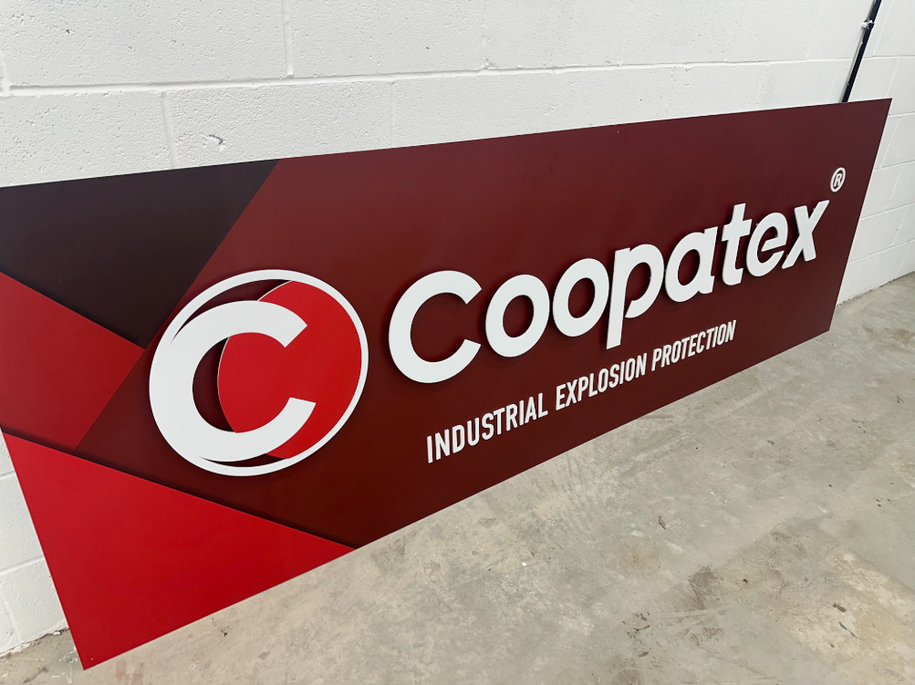
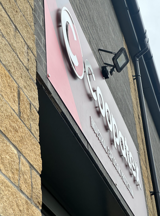
In 2026, I designed Coopatex’s warehouse signage and worked closely with the printers to make sure the finished result matched the original intention.
We used laser-cut material to raise the logo from the base board, creating a three-dimensional finish that gives the identity depth and makes it stand out.
The result was a clean, professional sign that brought the brand into the physical space with confidence.
An ongoing collaboration
I continue to work with Coopatex on marketing materials and website updates, keeping the identity consistent as the business moves forward.
From the original logo to vehicle graphics, office space design and warehouse signage, the collaboration has grown across both digital and physical applications.
Next, we’re planning a website overhaul to bring Coopatex a fresh new look. Watch this space.
Interested in working together? Fill out some info and I will be in touch shortly. Alternatively, you can book a call with me via Google Meet below. I can’t wait to hear from you!